
Manatee County School District K-12 Exhibition
March 3 – March 20, 2026
Opening Reception March 5, 5:00-7:00
Special Thanks to Award Sponsors: Florida Suncoast Watercolor Society & Manatee River Artists Guild
![]()
| AWARDS | # | ARTIST’S NAME | TITLE OF WORK | MEDIA |
| Grades K-2 | ||||
| 1ST PLACE | 178 | Moises S-H | The Daydreamer In The Sky | Mixed Media |
| 2ND PLACE | 144 | Erasmo R-V | Love Life | Mixed Media |
| 3RD PLACE | 45 | Amoire I | Silly Selfie | Tempera |
| HONORABLE MENTION | 137 | Elizabeth O | Where The Rap And The Glow Goes Together | Mixed Media |
| Grades 3-5 | ||||
| 1ST PLACE | 148 | Montzerrat B | Emotions | Watercolor |
| 2ND PLACE | 255 | Jackson G | Untitled | Mixed Media |
| 3RD PLACE | 122 | Makeah W | Bob | Watercolor |
| Best in 3D | 146 | Felix D | World Trade Center | Acrylic On Wood |
| HONORABLE MENTION | 120 | Faith J, Mia R, Miracle M, Demetrius S. | Panther Pop | Mixed Media |
| Grades 6-8 | ||||
| 1ST PLACE | 61 | Alessandra R-M | Christmas Eve | Colored Pencil/Pen |
| 2ND PLACE | 125 | Justine K | Under The Sea | Watercolor & Pen |
| 3RD PLACE | 165 | Audyn F | Untitled | Block Ink |
| Best in 3D | 186 | Jaiden G | Fred | Ceramic |
| HONORABLE MENTION | 253 | Willow R | Music Connection | Mixed Media |
| Grades 9-12 | ||||
| 1ST PLACE | 205 | Kaylee C | Eulogy | Oil |
| 2ND PLACE | 116 | Tayah B | Fusion | Oil Pastel & Tempera |
| 3RD PLACE | 239 | Ayevah W | Surreal Dream Scenario | Mixed Media |
| HONORABLE MENTION | 101 | Melanie H-G | Inferno | Oil Pastel |
| 3D Awards | ||||
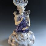
| 1ST PLACE | 107 | Mayle S-L | Siren Of The Sea | Ceramic |
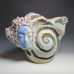
| 2ND PLACE | 106 | Nida V | Warmth Of Age | Ceramic |
| 3RD PLACE | 184 | Mylee M | Mapl | Ceramic |
| HONORABLE MENTION | 192 | Noah V | Nyan Cat | Fiber |
| Florida Suncoast Watercolor Society Best In Water Media | 99 | Flora M | Untitled | Watercolor & Color Pencil |
| Manatee River Arts Guild Outstanding 2D | 214 | Guadalupe M | Ocean Dawn | Acrylic |
| # | First | Last | Title | Medium | Price | Grade | School | Teacher |
| 1 | Emma | M | Under The Sea | Paint | NFS | 8 | BRMS | Heidi Enneking |
| 2 | Abigail | G | Ocean Blues | Crayons & Watercolor | NFS | 8 | BRMS | Heidi Enneking |
| 3 | Anahi | D | Mango Fish | Crayons & Watercolor | NFS | 8 | BRMS | Heidi Enneking |
| 4 | Audrey | M | The Blue And Purple Fish | Crayons & Watercolor | NFS | 7 | BRMS | Heidi Enneking |
| 5 | Sophia | F | Yellow Seahorse | Crayons & Watercolor | NFS | 8 | BRMS | Heidi Enneking |
| 6 | Sydney | B | Lonely Fish | Watercolor | NFS | 8 | BRMS | Heidi Enneking |
| 7 | Giulia | B-F | Brainless Beauty | Watercolor | NFS | 8 | BRMS | Heidi Enneking |
| 8 | Blake | S | Fish At Sunset | Chalk Pastels | $ 35 | 5 | Bashaw Elem | Rob Malecki |
| 9 | Sydney | K | Untitled | Chalk Pastels | NFS | 3 | Bashaw Elem | Rob Malecki |
| 10 | Ximena | C | Sunset On A Hill | Chalk Pastels | $ 12 | 5 | Bashaw Elem | Rob Malecki |
| 11 | Elio | C-G | A Kind Heart | Watercolor | NFS | K | JP Miller Elem | Laura Human |
| 12 | Piper | S | Heart Full Of Love | Watercolor | NFS | K | JP Miller Elem | Laura Human |
| 13 | Angely | D | The Jumping Spider | Mixed Media | NFS | 5 | JP Miller Elem | Laura Human |
| 14 | Helena | V-S | Electric Pumpkin | Mixed Media | NFS | 3 | JP Miller Elem | Laura Human |
| 15 | Rae | T | Hearts In Between | Mixed Media | NFS | 3 | JP Miller Elem | Laura Human |
| 16 | Lorena | F-S | Chocolore | Oil Pastel | NFS | 5 | JP Miller Elem | Laura Human |
| 17 | Nolan | B | Up Up And Away | Watercolor | NFS | 1 | Kinnan Elem | Kyle Radloff |
| 18 | Chloe | C | Under The Sea | Watercolor | NFS | 2 | Kinnan Elem | Kyle Radloff |
| 19 | Shantell | A | “Eye” See You | Watercolor | NFS | 4 | Kinnan Elem | Kyle Radloff |
| 20 | Maria | S-N | Peek A Boo | Watercolor | NFS | 5 | Kinnan Elem | Kyle Radloff |
| 21 | Levi | C | Dragon’s Eye | Watercolor | NFS | 5 | Kinnan Elem | Kyle Radloff |
| 22 | Chinonyelum | O | Save The Ocean | Acrylic | NFS | 3 | Rowlett Academy | Brittany Gerren |
| 23 | Donald | B | Thinking Marv | Mixed Media | NFS | 8 | Haile MS | Joseph Gibson |
| 24 | Whitney | W | Green Machine | Colored Pencils | NFS | 6 | Haile MS | Joseph Gibson |
| 25 | Aniston | B-M | Sleeping Foxes | Acrylic | NFS | 8 | Haile MS | Joseph Gibson |
| 26 | Maya | S | Spring Morning | Acrylic | NFS | 7 | Haile MS | Joseph Gibson |
| 27 | Madelyn | S | African Savannah | Mixed Media | NFS | 7 | Haile MS | Joseph Gibson |
| 28 | Marlie J, Camila P, Madelyn P, Sienna O, Lucy W | Simone Biles | Collage Mixed Media | NFS | 5 | Rowlett Academy | Brittany Gerren | |
| 29 | Elliana | G | Winter Tree Celebration | Tempera | NFS | 1 | Rowlett Academy | Brittany Gerren |
| 30 | Izan | G-B | My Own World | Collage & Oil Pastel | NFS | 3 | Rowlett Academy | Brittany Gerren |
| 31 | Otto | F | A Walk Through Time | Oil Pastel & Color Pencil | NFS | 3 | Rowlett Academy | Brittany Gerren |
| 32 | Nyla | R | Fruit Still Life | Chalk Pastels | NFS | 4 | Rowlett Academy | Brittany Gerren |
| 33 | Crew | R | Jugelis Violin | Acrylic & Posca | NFS | 4 | Rowlett Academy | Brittany Gerren |
| 34 | Yostin | R | Untitled | Sharpie & Colored Pencils | NFS | 8 | Lincoln MS | Dana Sackett |
| 35 | Nicole | N | Untitled | Graphite | NFS | 8 | Lincoln MS | Dana Sackett |
| 36 | Kiara | B | Untitled | Graphite | NFS | 6 | Lincoln MS | Dana Sackett |
| 37 | Airhiana | C | Untitled | Oil Pastels | NFS | 8 | Lincoln MS | Dana Sackett |
| 38 | Liliana | A-A | Untitled | Acrylic | NFS | 6 | Lincoln MS | Dana Sackett |
| 39 | Parker | J | Untitled | Oil Pastels | NFS | 7 | Lincoln MS | Dana Sackett |
| 40 | Myckendia | D | Untitled | Markers | NFS | 6 | Lincoln MS | Dana Sackett |
| 41 | Samaria | R V | Pookie Lashes | Chalk Pastels | NFS | 4 | Stewart Elem | Kristen Simpson |
| 42 | Jane | L | Jane’s Secret Aqua | Plaster | NFS | 4 | Stewart Elem | Kristen Simpson |
| 43 | Jade | P | Northern Lights Crystals | Colored Pencil & Chalk | NFS | 5 | Stewart Elem | Kristen Simpson |
| 44 | Owen | H | The Rainbow Heart | Tempera | NFS | 5 | Stewart Elem | Kristen Simpson |
| 45 | Amoire | I | Silly Selfie | Tempera | NFS | 1 | Stewart Elem | Kristen Simpson |
| 46 | Ryker | H | Saxophone In The Street | Tempera Collage | NFS | 3 | Stewart Elem | Kristen Simpson |
| 47 | Cora | L | Sea Friends | Tempera | NFS | K | Stewart Elem | Kristen Simpson |
| 48 | Janette | J | Pink Balloons | Digital | NFS | 6 | MSA MS | Debra Cline |
| 49 | Aaliyah | J | Doughnut Design | Digital | NFS | 6 | MSA MS | Debra Cline |
| 50 | Kendall | H | Flamingo | Digital | NFS | 6 | MSA MS | Debra Cline |
| 51 | Shea | G | Abstract Art | Digital | NFS | 6 | MSA MS | Debra Cline |
| 52 | Aubrey | D | Sleeping Flamingo | Digital | NFS | 6 | MSA MS | Debra Cline |
| 53 | Mya | A | Toucan | Digital | NFS | 6 | MSA MS | Debra Cline |
| 54 | Sarah | L | Op Art | Digital | NFS | 6 | MSA MS | Debra Cline |
| 55 | Angel | S | Dolphin | Paper Mache’ | NFS | 4 | Sea Breeze Elem | Chrystal Rose |
| 56 | Gerardo | P | Sea Turtle | Paper Mache’ | NFS | 5 | Sea Breeze Elem | Chrystal Rose |
| 57 | Isabella | P | Hello Kitty | Cardboard & Plastic Tiles | $ 50 | 5 | Sea Breeze Elem | Chrystal Rose |
| 58 | Samantha | P | Jelly Fish | Paper Mache’ & String | NFS | 5 | Sea Breeze Elem | Chrystal Rose |
| 59 | Makyla | M | Reflections Of Pup | Mixed Media | $100 | 7 | King MS | Robert Truby |
| 60 | Itzel | R-R | Whale Shark | Paper Mache’ | $100 | 5 | Sea Breeze Elem | Chrystal Rose |
| 61 | Alessandra | R-M | Christmas Eve | Mixed Media | $100 | 8 | King MS | Robert Truby |
| 62 | Jayden | B-B | Sadie And Seth | Watercolor, Marker, Pencil | $100 | 8 | King MS | Robert Truby |
| 63 | Hadley | C | Hadley’s Pet Dress Designs | Colored Pencil | NFS | 5 | Palma Sola Elem | Doreen Chaloupka-Cosentino |
| 64 | Olivia | B | Rainbow Willa | Mixed Media | NFS | 5 | Palma Sola Elem | Doreen Chaloupka-Cosentino |
| 65 | Aurora | T | Bobby The Bob Bob Jr. | Mixed Media | NFS | 3 | Palma Sola Elem | Doreen Chaloupka-Cosentino |
| 66 | Kensley | B | Donut | Mixed Media | NFS | 3 | Palma Sola Elem | Doreen Chaloupka-Cosentino |
| 67 | Eric | G | Charlie | Mixed Media | NFS | 2 | Palma Sola Elem | Doreen Chaloupka-Cosentino |
| 68 | Harper | C | Preppy Owl | Mixed Media | NFS | 5 | Palma Sola Elem | Doreen Chaloupka-Cosentino |
| 69 | Ximena | R | Untitled | Tempera | NFS | K | Johnson K-8 | Suzie Abadjian |
| 70 | Ana Victoria | V | Elephant | Mixed Media | NFS | 1 | Johnson K-8 | Suzie Abadjian |
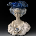
| 71 | Mariana | P | Line Portrait | Watercolor & Marker | NFS | 5 | Johnson K-8 | Suzie Abadjian |
| 72 | Cayden | H | Dandelion | Tempera & Marker | NFS | 2 | Johnson K-8 | Suzie Abadjian |
| 73 | Kali | M | Shapes, Lines & Color | Tempera | NFS | 3 | Johnson K-8 | Suzie Abadjian |
| 74 | Norah | W | Untitled | Mixed Media | NFS | 5 | Johnson K-8 | Suzie Abadjian |
| 75 | Fadwa | S | Untitled | Mixed Media | NFS | 5 | Johnson K-8 | Suzie Abadjian |
| 76 | Jadic | R | Cityscape | Watercolor & Ink | NFS | 6 | Johnson K-8 | Gregory Corban |
| 77 | Jeylee | A-P | Waterfall | Watercolor | NFS | 8 | Johnson K-8 | Gregory Corban |
| 78 | Jessica | G | Nature Scape | Watercolor & Pencil | NFS | 8 | Johnson K-8 | Gregory Corban |
| 79 | Lilliahna | H | Diversity Of Hand | Colored Pencil | NFS | 8 | Johnson K-8 | Gregory Corban |
| 80 | Zy’Tavious | C | Abstractions Of Design | Oil Pastels | NFS | 8 | Johnson K-8 | Gregory Corban |
| 81 | Scarlett | H | Building Perspectives | Pencil | NFS | 8 | Johnson K-8 | Gregory Corban |
| 82 | Meliah | M | Still Life With Vase | Colored Pencil | NFS | 8 | Johnson K-8 | Gregory Corban |
| 83 | Genesis | V P | Heart Gaze | Acrylic | NFS | 4 | Bayshore Elem | Kimberly Hale |
| 84 | Delayza | M | Lines & Colors | Watercolor & Acrylic | NFS | 1 | Bayshore Elem | Kimberly Hale |
| 85 | Ylianna | F | Flying Carpet | Fiber & Paper | NFS | 5 | Bayshore Elem | Kimberly Hale |
| 86 | Kingston | H | The Flower | Watercolor & Crayon | NFS | 3 | Bayshore Elem | Kimberly Hale |
| 87 | Luna | R C | Grassy Bee | Acrylic | NFS | 4 | Bayshore Elem | Kimberly Hale |
| 88 | Adriana | P | Colorful Cloud | Watercolor & Acrylic | NFS | 5 | Bayshore Elem | Kimberly Hale |
| 89 | Myla | K | Little Fishes | Acrylic | NFS | 3 | Bayshore Elem | Kimberly Hale |
| 90 | Macy | M | One With The Wild | Tempera & Oil Pastel | NFS | 5 | Williams Elem | Kati Pac |
| 91 | Raevin | V | Jumping Fish | Texture Collage | NFS | K | Williams Elem | Kati Pac |
| 92 | Alexandra | I | Wavy | Tempera | NFS | 1 | Williams Elem | Kati Pac |
| 93 | Evelyn | R | Night Owl | Paper Collage | NFS | 3 | Williams Elem | Kati Pac |
| 94 | Emilio | O | Rowlett | Paper Collage | NFS | 3 | Williams Elem | Kati Pac |
| 95 | Beatris | A-D | Midnight Blues | Ceramics | NFS | 12 | Bayshore HS | Colleen Hallinger |
| 96 | Serafina | C | Alone Under The Stars | Acyrlic | NFS | 11 | Manatee HS | Melissa Link |
| 97 | Shannon | M | Watchful Eyes | Acrylic | NFS | 12 | Manatee HS | Melissa Link |
| 98 | Hellen Sofia | M O | Discovering The Soul Of Colombia | Acrylic & Watercolor | $ 90 | 12 | Manatee HS | Melissa Link |
| 99 | Flora | M | Untitled | Watercolor & Color Pencil | NFS | 12 | Manatee HS | Melissa Link |
| 100 | Madison | T | Faces Within Souls | Acrylic | NFS | 10 | Manatee HS | Melissa Link |
| 101 | Malanie | H-G | Inferno | Oil Pastel | NFS | 11 | Manatee HS | Melissa Link |
| 102 | Gracie | T | Eye-am-phora | Ceramics | $300 | 11 | Manatee HS | Elizabeth Azcarraga |
| 103 | Ariacnna | E | Gingerbread House | Ceramics | NFS | 11 | Manatee HS | Elizabeth Azcarraga |
| 104 | Coral | S | Fear | Digital | $ 75 | 12 | Manatee HS | Melissa Link |
| 105 | Connor | B | Nap Time | Ceramics | NFS | 12 | Manatee HS | Elizabeth Azcarraga |
| 106 | Nida | V | Warmth Of Age | Ceramics | $150 | 12 | Manatee HS | Elizabeth Azcarraga |
| 107 | Mayle | S-L | Siren Of The Sea | Ceramics | NFS | 11 | Manatee HS | Elizabeth Azcarraga |
| 108 | Alysson | M | Swan Lake Cake | Ceramics | NFS | 12 | Manatee HS | Elizabeth Azcarraga |
| 109 | Luna | G | Frankenstein | Ceramics | NFS | 11 | Manatee HS | Elizabeth Azcarraga |
| 110 | Eric | F | Lava Pitt | Pen, Marker, Colored Pencil | NFS | 5 | Tara Elem | Kevin Olson |
| 111 | Samantha | B | 3 Donuts | Oil Pastel | NFS | 5 | Tara Elem | Kevin Olson |
| 112 | Ellie | H | Negative Positive Hearts | Collage | NFS | K | Tara Elem | Kevin Olson |
| 113 | Declan | F | Tangles Of Practice | Pen & Ink | NFS | 4 | Tara Elem | Kevin Olson |
| 114 | Charlotte | W | Cheeseburger In Cat Paradise | Acrylic | NFS | 4 | Tara Elem | Kevin Olson |
| 115 | Kazmiere | H | The Firebird | Paper | $ 50 | 11 | Manatee HS | Lyn Bollmeyer |
| 116 | Taya | B | Fusion | Oil Pastel & Tempera | NFS | 9 | Manatee HS | Lyn Bollmeyer |
| 117 | Lidia | G | Bride | Watercolor | $ 50 | 10 | Manatee HS | Lyn Bollmeyer |
| 118 | Emma | K | Purity | Graphite & Charcoal | NFS | 10 | Manatee HS | Lyn Bollmeyer |
| 119 | Isaac | B | Magical Garden | Watercolor | $ 50 | 9 | Manatee HS | Lyn Bollmeyer |
| 120 | Faith J, Mia R, Miracle M, Demetrius S | Panther Pop | Mixed Media | NFS | 4 | Palm-View K-8 | Caitlin Doney | |
| 121 | Yairiel | G-L | Creole Reflection | Watercolor | NFS | 5 | Palm-View K-8 | Caitlin Doney |
| 122 | Makaeh | W | Bob | Watercolor | NFS | 5 | Palm-View K-8 | Caitlin Doney |
| 123 | Amyah | W | Pebbles | Watercolor | NFS | 5 | Palm-View K-8 | Caitlin Doney |
| 124 | Marina | F | Mr. Bubbles | Watercolor | NFS | 5 | Palm-View K-8 | Caitlin Doney |
| 125 | Justine | K | Under The Sea | Watercolor & Pen | NFS | 7 | Palm-View K-8 | Railene Jones |
| 126 | Casandra | R | What You Heard | Watercolor & Color Pencil | $ 25 | 8 | Palm-View K-8 | Railene Jones |
| 127 | Lilliana | A | A Fish In The Sea | Watercolor | NFS | 7 | Palm-View K-8 | Railene Jones |
| 128 | Yunielys | S | Weeping Innocence | Digital | NFS | 11 | BRHS | Megan Shinham |
| 129 | Ruthie Ann | S | Oktopous | Mixed Media | NFS | 11 | BRHS | Megan Shinham |
| 130 | Victoria | M | A Peaceful Dream | Mixed Media | NFS | 11 | BRHS | Megan Shinham |
| 131 | Samuel | Z | The Artist’s Eye | Digital | NFS | 11 | BRHS | Megan Shinham |
| 132 | Sarai | P-H | Two Souls | Digital | NFS | 12 | BRHS | Megan Shinham |
| 133 | Kinley | L | Snowy | Collage | NFS | K | Mills Elem | Maureen Parinello |
| 134 | Iris | M | Big Fat Rabbit In A Meadow | Oil Pastel | NFS | 3 | Mills Elem | Maureen Parinello |
| 135 | Angela | N | Cloudy Street | Watercolor & Marker | NFS | 5 | Mills Elem | Maureen Parinello |
| 136 | Garrett | R | KL | Watercolor & Tempera | NFS | 2 | Mills Elem | Maureen Parinello |
| 137 | Elizabeth | O | Where The Rap And The Glow Goes Together | Mixed Media | NFS | 2 | Mills Elem | Maureen Parinello |
| 138 | Liliana | M | Girl’s Best Friend | Acrylic | NFS | 12 | BRHS | Megan Shinham |
| 139 | Mia | F | The Escape Room | Watercolor & Marker | NFS | 4 | Mills Elem | Maureen Parinello |
| 140 | Colton | S | A Little Town Off The Side Of Nowhere | Watercolor & Marker | NFS | 5 | Mills Elem | Maureen Parinello |
| 141 | Erasmo | R-V | Love Life | Mixed Media | $ 20 | 2 | Ballard Elem | Valeri Borstelmann |
| 142 | Jordyn | P | Dream Big | Watercolor | $ 50 | 4 | Ballard Elem | Valeri Borstelmann |
| 143 | Julian | S | Sunset | Watercolor | $ 40 | 4 | Ballard Elem | Valeri Borstelmann |
| 144 | Maria | S-P | Self-Portrait | Mixed Media Collage | NFS | K | Ballard Elem | Valeri Borstelmann |
| 145 | Helen | S-M | A Good Day At The Boardwalk | Watercolor | $ 80 | 4 | Ballard Elem | Valeri Borstelmann |
| 146 | Felix | D | World Trade Center | Acrylic | $ 65 | 4 | Ballard Elem | Valeri Borstelmann |
| 147 | Yaleira | V | Empire State Building | Acrylic | $ 70 | 4 | Ballard Elem | Valeri Borstelmann |
| 148 | Montzerrat | B | Emotions | Watercolor | $ 50 | 5 | Daughtrey Elem | Kait James |
| 149 | Lapatrada | N | Morning Serenity | Watercolor & Acrylic | $ 40 | 8 | Lee MS | Karen Meinberg |
| 150 | Lotus | B | Lillieo | Acrylic | $ 20 | 8 | Lee MS | Karen Meinberg |
| 151 | Maria | B | All Is Calm | Watercolor & Pen | $ 20 | 8 | Lee MS | Karen Meinberg |
| 152 | Sofia | M | Peace Bridge | Acrylic | NFS | 7 | Lee MS | Karen Meinberg |
| 153 | Jubilee | R-O | Sunset Roost | Oil Pastel | $125 | 8 | Lee MS | Karen Meinberg |
| 154 | Natalie | P-L | Free | Oil Pastel | $ 20 | 8 | Lee MS | Karen Meinberg |
| 155 | Stephanie | F-T | Upon The Flowers I Come Across | Mixed Media | NFS | 8 | Lee MS | Karen Meinberg |
| 156 | Yaretzi | A | My Mom’s Flowers | Watercolor | $ 15 | 5 | Daughtrey Elem | Kait James |
| 157 | Mailen | A | The Beautiful Mirror | Watercolor | $ 25 | 2 | Daughtrey Elem | Kait James |
| 158 | Lizbeth | H-M | Loving Light | Watercolor | $ 50 | 4 | Daughtrey Elem | Kait James |
| 159 | Dylan | A-G | Happiness | Watercolor | $ 50 | 1 | Daughtrey Elem | Kait James |
| 160 | Olivia | M | Day And Night | Cardboard & Acrylic | NFS | 8 | Mona Jain MS | Stefani Lis |
| 161 | Olivia | M | Untitled | Color Pencil | NFS | 8 | Mona Jain MS | Stefani Lis |
| 162 | Yashvi | P | A Conversation | Watercolor & Color Pencil | NFS | 8 | Mona Jain MS | Stefani Lis |
| 163 | Rylee | J | Lionfish | Mixed Media | NFS | 8 | Mona Jain MS | Stefani Lis |
| 164 | Valerie | M | Flowers | Acrylic | NFS | 8 | Mona Jain MS | Stefani Lis |
| 165 | Audyn | F | Untitled | Ink | NFS | 7 | Mona Jain MS | Stefani Lis |
| 166 | Madison | W | Self In Color | Mixed Media | NFS | 8 | Mona Jain MS | Stefani Lis |
| 167 | Cole | A | Go USA | Origami Relief | NFS | 4 | Gullett Elem | Melissa Raynor |
| 168 | Harper | M | Origami Sculpture | Paper | NFS | 4 | Gullett Elem | Melissa Raynor |
| 169 | Savannah | P | Snail | Collage | NFS | K | Gullett Elem | Melissa Raynor |
| 170 | Mia | F | Analogous Leaves | Watercolor | NFS | 5 | Gullett Elem | Melissa Raynor |
| 171 | Houston | R | Ice Skating Snowman | Collage | NFS | K | Gullett Elem | Melissa Raynor |
| 172 | Bodhi | G | Owl | Paper | NFS | 2 | Gullett Elem | Melissa Raynor |
| 173 | Mason | R | Self Portrait | Mixed Media | NFS | 3 | Gullett Elem | Melissa Raynor |
| 174 | Gabriella | M | Contrasting Currents | Color Pencil | NFS | 6 | Parrish Charter | Olivia Thornton |
| 175 | Catherine-Maria | L | Lunar New Year | Mixed Media | NFS | 7 | Parrish Charter | Olivia Thornton |
| 176 | Ryane | S | Op Art | Color Pencil | NFS | 6 | Parrish Charter | Olivia Thornton |
| 177 | Zoe | C | Cat & Bird | Oil Pastel & Watercolor | NFS | 2 | Abel Elem | Kimberly Lambert |
| 178 | Moises | S-H | The Daydreamer In The Sky | Mixed Media | NFS | K | Abel Elem | Kimberly Lambert |
| 179 | Isabella | C | Still Life Objects | Pencil | $ 50 | 4 | Abel Elem | Kimberly Lambert |
| 180 | Valerie | R | Mountain Landscape | Watercolor & Marker | NFS | 5 | Abel Elem | Kimberly Lambert |
| 181 | Hunter | P | The Animal Meating | Pencil | $ 50 | 3 | Abel Elem | Kimberly Lambert |
| 182 | Briana | P | Untitled | Pencil | $ 60 | 4 | Abel Elem | Kimberly Lambert |
| 183 | Aniyah | R | Still Life With Markers | Pencil | $ 50 | 4 | Abel Elem | Kimberly Lambert |
| 184 | Mylee | M | Hapi | Ceramics | NFS | 10 | MSA HS | Michelle Clinton |
| 185 | Jaida | M | Raccoon | Ceramics | NFS | 9 | MSA HS | Michelle Clinton |
| 186 | Jaiden | G | Fred | Ceramics | NFS | 8 | MSA MS | Michelle Clinton |
| 187 | Madison | R | Happy Axolotl | Ceramics | NFS | 9 | MSA HS | Michelle Clinton |
| 188 | Eva | H | Anubis Canopic Jar | Ceramics | NFS | 8 | MSA MS | Michelle Clinton |
| 189 | Ava | B | Share A Smile | Metal & Polymer Clay | NFS | 10 | MSA HS | Lisa Sherer |
| 190 | Sky | D | Diascia | Mixed Media | NFS | 8 | MSA MS | Lisa Sherer |
| 191 | Janeliz | G-D | Kiki | Fibers | NFS | 11 | MSA HS | April Gladden |
| 192 | Noah | V | Nyan Cat | Fibers | NFS | 11 | MSA HS | April Gladden |
| 193 | Sarahi | P | Rocky | Fibers | NFS | 12 | MSA HS | April Gladden |
| 194 | Angeline | B | Warhol Style Maluma | Acrylic | NFS | 8 | MSA MS | Melissa Aldan |
| 195 | Olivia | H | The Loyalty Of Friendship | Digital | NFS | 12 | MSA HS | Melissa Aldan |
| 196 | Riley | G | Ugly Duckling | Digital | NFS | 11 | MSA HS | Melissa Aldan |
| 197 | Noah | Y | The Root Of All Evil | Mixed Media | NFS | 12 | MSA HS | Melissa Aldan |
| 198 | Haley | A | Fox In Curtain | Color Pencil | $ 10 | 9 | MSA HS | Sarah Moudry |
| 199 | Lee | L | Swimming In Fantasy | Digital | $100 | 12 | MSA HS | Pamela LeBuffe |
| 200 | Alison | C | Crystal Spacecraft | Color Pencil | NFS | 9 | MSA HS | Sarah Moudry |
| 201 | Nahiomara | S | Break Through | Gouache | $300 | 12 | MSA HS | Melissa Aldan |
| 202 | Leslie | C-B | Apple Obsession | Digital | $180 | 12 | MSA HS | Pamela LeBuffe |
| 205 | Kaylee | C | Eulogy | Oil | NFS | 10 | MSA HS | Diane Rosenbarger |
| 203 | Hadley | F | The Psychic | Acrylic | NFS | 9 | MSA HS | Sarah Moudry |
| 204 | Critzalee | M | Legacy In A Bloom | Acrylic | NFS | 12 | MSA HS | Diane Rosenbarger |
| 206 | Jackson | P | Dictator Picatchu | Acrylic | $ 15 | 9 | MSA HS | Sarah Moudry |
| 207 | Mya | N | Peace Of Letting Go | Acrylic | NFS | 11 | MSA HS | Diane Rosenbarger |
| 208 | Kaden | M | Koromias Effie | Acrylic | NFS | 9 | MSA HS | Sarah Moudry |
| 209 | Revelin | P | Temperence | Acrylic | NFS | 11 | MSA HS | Diane Rosenbarger |
| 210 | John | S | An Unexploded Ordnance | Acrylic | NFS | 9 | MSA HS | Sarah Moudry |
| 211 | Lainey | R | Pillars Of LIght | Mixed Media | NFS | 9 | MSA HS | Diane Rosenbarger |
| 212 | Greta | B | The Loyal Heart | Acrylic | NFS | 11 | MSA HS | Sarah Moudry |
| 213 | Jordyn | A | Holly | Mixed Media | NFS | 10 | MSA HS | Melissa Aldan |
| 214 | Guadalupe | M | Ocean Dawn | Acrylic | NFS | 10 | MSA HS | Diane Rosenbarger |
| 215 | Ashlyn | O | Roseate Wings | Acrylic | NFS | 10 | MSA HS | Diane Rosenbarger |
| 216 | Lucy | C | Whittling | Digital | NFS | 12 | MSA HS | Pamela LeBuffe |
| 217 | Hailey | V | Humanity In Technology | Pen & Watercolor | $130 | 12 | MSA HS | Melissa Aldan |
| 218 | Lilly | K | Foggy Forest | Watercolor | NFS | 8 | MSA MS | Pamela LeBuffe |
| 219 | Clarissa | S | Peacock Spreading Feathers | Block Print | $110 | 10 | Palmetto HS | Elizabeth Lopacki |
| 220 | Alyssa | L | Fij | Block Print | $100 | 11 | Palmetto HS | Elizabeth Lopacki |
| 221 | Sofia | P | Untitled | Block Print | $ 58 | 11 | Palmetto HS | Elizabeth Lopacki |
| 222 | Keyly | Q | Crabby McCrabface | Block Print | $110 | 10 | Palmetto HS | Elizabeth Lopacki |
| 224 | Ashlynn | M | Tropical Rhythm | Block Print | $ 55 | 11 | Palmetto HS | Elizabeth Lopacki |
| 223 | Valeria | R-T | Cherry Blossom Bloom | Color Pencil | $ 5 | 9 | Palmetto HS | Elizabeth Lopacki |
| 225 | Alexandra | R-P | Memory Of My Life | Mixed Media | NFS | 9 | Palmetto HS | Elizabeth Lopacki |
| 226 | Chelcy | C | My Little Lillies | Block Print | $100 | 11 | Palmetto HS | Elizabeth Lopacki |
| 227 | Joel | H | Mountainscape | Ink | NFS | 11 | Palmetto HS | Elizabeth Lopacki |
| 228 | Arianna | M | The Early Bird’s Sunrise | Mixed Media | NFS | 3 | BR Elem | Rebecca Misla |
| 229 | Sophia | A | Guardian Of The Sun | Tempera | NFS | 5 | BR Elem | Rebecca Misla |
| 230 | Alessia | S | Venemous Horizon | Mixed Media | NFS | 5 | BR Elem | Rebecca Misla |
| 231 | Tempe | S | Attracted To The Light | Watercolor | NFS | 4 | BR Elem | Rebecca Misla |
| 232 | Hadley | D | The Sun-Soaked Stare | Mixed Media | NFS | 5 | BR Elem | Rebecca Misla |
| 233 | Addison | K | Firebreather | Color Pencil | NFS | 4 | BR Elem | Rebecca Misla |
| 234 | Charleigh | W | The Monarch’s Garden | Watercolor | NFS | 4 | BR Elem | Rebecca Misla |
| 235 | Tyra | G | Tinker Bell’s Fairy House | Ceramics | NFS | 12 | Southeast HS | Sherie Pierce |
| 236 | Udiel | H-C | Portrait Of A Seminole | Pencil | NFS | 10 | Southeast HS | Sherie Pierce |
| 237 | Eber | I | Duolingo Owl | Ceramics | $500 | 12 | Southeast HS | Sherie Pierce |
| 238 | Harmony | S | Sunshine Flower Teacup/Saucer | Ceramics | NFS | 12 | Southeast HS | Sherie Pierce |
| 239 | Ayevah | W | Surreal Dream Scenario | Mixed Media | $650 | 9 | Southeast HS | Sherie Pierce |
| 240 | Natalie | M | Ghost Horse | Scratchboard | NFS | 10 | Southeast HS | Sherie Pierce |
| 241 | Melina | C | Dance Of The Humming Betta | Colored Pencil | NFS | 11 | Southeast HS | Sherie Pierce |
| 242 | Valerie | P-G | Sea Turtle | Oil Pastel | NFS | 8 | Sugg MS | Ames Gerstenberger |
| 243 | Kharma | B-N | River Sunset | Oil Pastel | NFS | 7 | Sugg MS | Ames Gerstenberger |
| 244 | Madison | P | Sunset Valley | Oil Pastel | $ 90 | 8 | Sugg MS | Ames Gerstenberger |
| 245 | Annabelle | C | A Clown Fish’s Home | OIl Pastel | NFS | 8 | Sugg MS | Ames Gerstenberger |
| 246 | Jordan | S | Cupcake | Ceramics | NFS | 6 | Sugg MS | Ames Gerstenberger |
| 247 | Zoe | B | Vivisection | Digital | NFS | 8 | Rowlett MA | Brittany Braniger |
| 248 | Luis | D | Roman Colosseum | Chalk Pastel | NFS | 8 | Rowlett MA | Brittany Braniger |
| 249 | Austin | J | Lush Foggy River | Acrylic & Color Pencil | NFS | 7 | Rowlett MA | Brittany Braniger |
| 250 | Valeria | J-P | Floral Vines | Ceramics | $100 | 8 | Sugg MS | Ames Gerstenberger |
| 251 | Zoey | G | Bright Sunset | Acrylic & Markers | NFS | 7 | Rowlett MA | Brittany Braniger |
| 252 | Katerin | G-S | Peace | Colored Pencil & Watercolor | NFS | 8 | Rowlett MA | Brittany Braniger |
| 253 | Willow | R | Music Connection | Mixed Media | NFS | 7 | Rowlett MA | Brittany Braniger |
| 254 | Esai | M-N | The Modern Beats On | Mixed Media | NFS | 8 | Rowlett MA | Brittany Braniger |
| 255 | Jackson | G | Untitled | Mixed Media | NFS | 4 | Anna Maria Elem | Beth McIntosh |
| 256 | Louis | B | The Half-n-Half King | Mixed Media | NFS | 5 | Anna Maria Elem | Beth McIntosh |
| 257 | Bianca | E | Spring Fields | Mixed Media | NFS | 2 | Anna Maria Elem | Beth McIntosh |
| 258 | Phoenix | H | Untitled | Mixed Media | NFS | 5 | Anna Maria Elem | Beth McIntosh |
| 259 | Amari | J | The Amari | Mixed Media | NFS | 5 | Anna Maria Elem | Beth McIntosh |
| 260 | Savanna | S | Lost In Flowers | Mixed Media | NFS | 5 | Anna Maria Elem | Beth McIntosh |
| 261 | Luke | P | True Colors | Mixed Media | NFS | 5 | Anna Maria Elem | Beth McIntosh |
| 262 | Osvaldo | C O | Color Burst Mask | Oil Pastel | NFS | 5 | Freedom Elem | Athena Nugent |
| 263 | Marina | S | Mystery In Motion | Oil Pastel | NFS | 5 | Freedom Elem | Athena Nugent |
| 264 | Abby | V | Watercolor Sunrise | Watercolor | NFS | 4 | Freedom Elem | Athena Nugent |
| 265 | Hixon | C | Snowy Owl | Paper Collage | NFS | K | Freedom Elem | Athena Nugent |
| 266 | Finn | P | Streetlight | Colored Pencil, Sharpie | NFS | 5 | McNeal Elem | Beatrix Schaeffer |
| 267 | Mia | M | Rose | Watercolor, Sharpie | NFS | 5 | McNeal Elem | Beatrix Schaeffer |
| 268 | Kierstyn | D | Wave | Colored Pencil | NFS | 5 | McNeal Elem | Beatrix Schaeffer |
| 269 | Ruhi | S | Northern Lights | Chalk Pastels | NFS | 5 | McNeal Elem | Beatrix Schaeffer |
| 270 | Birdie | G | City | Mixed Media | NFS | 5 | McNeal Elem | Beatrix Schaeffer |
| 271 | Nolan | D | City | Colored Pencil, Sharpie | NFS | 5 | McNeal Elem | Beatrix Schaeffer |
| 272 | Reagan | R | Aquarium | Mixed Media | NFS | 5 | McNeal Elem | Beatrix Schaeffer |
| 273 | Isaac | S | Big And Little Koru Spiral Volcano | Tempera | NFS | 2 | Gene Witt | Kim Roberson-Hoy |
| 274 | Noah | T | Roses Are Red Koruk Spiral | Tempera | NFS | 1 | Gene Witt | Kim Roberson-Hoy |
| 275 | Sydney | S | Pink Power Koru Spiral | Tempera | NFS | 1 | Gene Witt | Kim Roberson-Hoy |
| 276 | Colton | F | Swordfish | Mixed Tempera, Watercolor | NFS | 5 | Gene Witt | Kim Roberson-Hoy |
| 277 | Jason | L | Koi Fish | Mixed Tempera, Watercolor | NFS | 5 | Gene Witt | Kim Roberson-Hoy |
| 278 | Brock | G | Anglerfish | Mixed Tempera, Watercolor | NFS | 4 | Gene Witt | Kim Roberson-Hoy |
| 279 | Kairi | S | Seahorse | Mixed Tempera, Watercolor | NFS | 3 | Gene Witt | Kim Roberson-Hoy |
| 280 | Grace | G | The Castle | Cardboard/Foam | NFS | 5 | Sea Breeze Elem | Chrystal Rose |
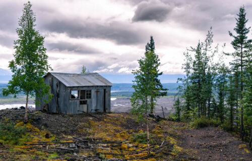
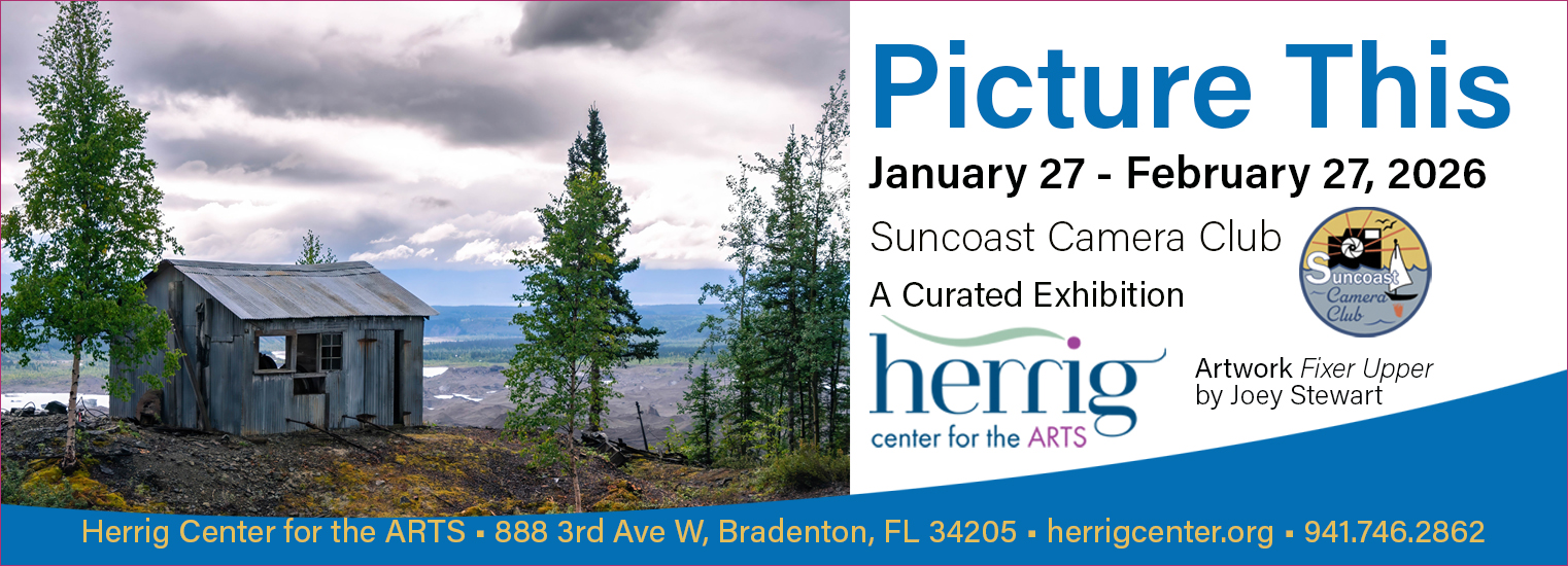 Picture This, A Curated Exhibition


Follow us on